Today I review my own custom theme, and how I came up with its design.
- Harmonizing my content goals with my personality.
- Why I made the design decisions I did.
- What design challenges I faced.
- What little things I loved most.
- What makes it unique.
I also showcase another site that copied from mine. 😉
WPJohnny’s design goals
What many of you don’t know is the story of how WPJohnny was designed. What problems I was trying to solve. And what past life experience I already had with WordPress. Experience truly is your #1 teacher.
1. Content-based design
This is something most people will never understand because their content sucks. They have nothing of real value to say and so the only way to make their site interesting is to have fancy design gimmicks…. flashy images, sliders, animations, scrolling widgets and other random junk.
I like to use the sexy-body analogy. Pretend there’s a guy who’s built like a Greek god. He can look good shirtless with bedhead. But what if it’s a terribly out-of-shape guy? Well…now you gotta put a suit on him, cut his hair, fancy shoes, nice watch.
I feel the same way about content. When you have naturally sexy content, you just want to get right to it. You don’t want “design” in the way. You don’t want colors and boxes and effects. Believe it or not…I try to design my sites to be as “un-designed” as possible!
I want people to hear my voice, not the colors of my website!
2. Text-based (not image-based)
Now that we’ve established how I want my design to be content-based…the next part was to understand what my content really is. It’s 99% text…no images.
I purposely made my site text-based because I want to focus on my writing, not on images. I hate choosing blog images more than anything. On my older blogs from many years ago, finished posts were often delayed from publishing because I didn’t have an image ready.
Besides, I don’t feel images are really needed. People can scan your article titles easily enough if you case them in a certain style.
- How to Build a WordPress Site – most sites.
- How to BUILD a WordPress site – mine.
And I’ve come to use it as my signature design style compared to other blogs out there always putting some random graphic. You see? It’s easy to be unique when you’re doing something out of personal necessity.
3. Clean spacing
This is both easier and harder than you think. To have a clean-website, you need to not have so many things. You have to resist putting junk on your page. Sidebars, ads, newsletters, etc. Luckily for me, WPJohnny truly is a passion blog. I don’t do it for money and so I don’t have to battle a never-ending war between editorial and ads.
The hard part is to figure out the spacing. The first part is spacing between the text. Yeah yeah yeah, designers talk about the golden ratio and what not all the time. But it’s never so easy. You really have to judge carefully with each font. How it takes on bullets, punch sizes, x-heights. So many little details.
The next part is spacing between the content areas. Usually, people space them far enough that there’s a clear distinction between them. Real-world application is not-so-easy IMO.
4. Lightweight & FAST
I wanted a site that was razor fast. Not just instant load on desktop but also in mobile! Believe it or not, the easiest part was to have it clean-coded. Every little piece of code was carefully written. No bloated frameworks or generic stuff left behind. I completely cleaned house on the theme. In many cases, I was willing to have things hard-coded to reduce PHP processing.
No dropdown menus for mobile. No webfont; I went pure system fonts (which can be tricky to look “polished”). And of course, no CSS or JS unless it was absolutely necessary. The result was super SUPER lean custom theme. CSS was written mobile-first as well…which I think is painstaking to work from. My mind still processes things desktop first.
5. Informative & easy to find
The real goal behind clean-spacing and light wasn’t just for the “feeling” of clean-ness and speed. It was for the real world benefit of being able to find things quickly. I hate the kind of clean website that takes you forever to find things because they’re all spaced apart.
I wanted a site that could hold tons of info and easy to find the specific bit you want! This requires a clever layering of design where you can make info disappear when the user isn’t looking for them, yet instantly found when searched for.
In moments like this, you cannot just space everything farther because then the overall design takes up more space. You’ll have to use careful layering of colors to distinguish them cleanly so you don’t have to eat up more space.
6. Neutral but textured coloring
The coloring of the site had to be very careful because I didn’t plan to use images. Many sites out there use a very neutral color scheme (white, black, or blue) and then rely on the color from their content images to bring life into the site. If you go without images on your site, then whatever your theme color is quickly becomes the “color” that users feel on your site. And you better make sure it’s not a color that gets tiring quickly.
That for me, meant no reds or oranges and that sort of aggressive color. I went with yellow because I love that color in real-life. It represents me well. It’s both energetic but also calm and friendly. My boxing nickname is actually “The Black Lion” and so naturally BLACK & YELLOW is almost always in most things that I do. It truly is my color. I didn’t choose it to look cool.
The hardest part about using color is when you don’t want your visitors to FEEL all the colors. My site is not a Skittles “Taste the rainbow” commercial. The colors are there to help distinguish things, tell you what’s important and separate different areas from each other. To do this, I focus more on color texture than color accents. Judicious use of both will give you something clean that has life but doesn’t feel overly “colorful”.
7. I hate boxes
I absolutely hate boxes with a passion. Many “designers” are so un-clever that they don’t know how to separate different sections other than to draw boundary lines between them. EWWWWWWW!
These boundary lines make the content feel restricted and trapped. They also break the “space” effect between the content. Imagine you and a friend standing 10 feet apart from each other…you feel the space, right? Now put a fence between you and is there still space? NO! Because now you only feel the space between you and the fence. The stupid fence makes both of you feel restricted.
If you look at my design, I work hard not to fence my content from each other. I do box layering or I carefully choose gutter widths that aren’t so obvious. Anyway, it’s hard to explain and I’m lazy now.
8. Least amount of scrolling possible
I believe scrolling should only be encouraged on a site only when it’s fun. For example….Facebook or Youtube, you enjoy the scroll because you’re seeing enjoyable content.
But what about when users are scrolling because they’re lost or overwhelmed and can’t find what they need? In moments like that scrolling becomes a painful experience where you’re never sure if you’ve scroll too little or too much. The scrolling even makes your site feel unruly and disorganized.
WPJohnny’s design aesthetics (and why)
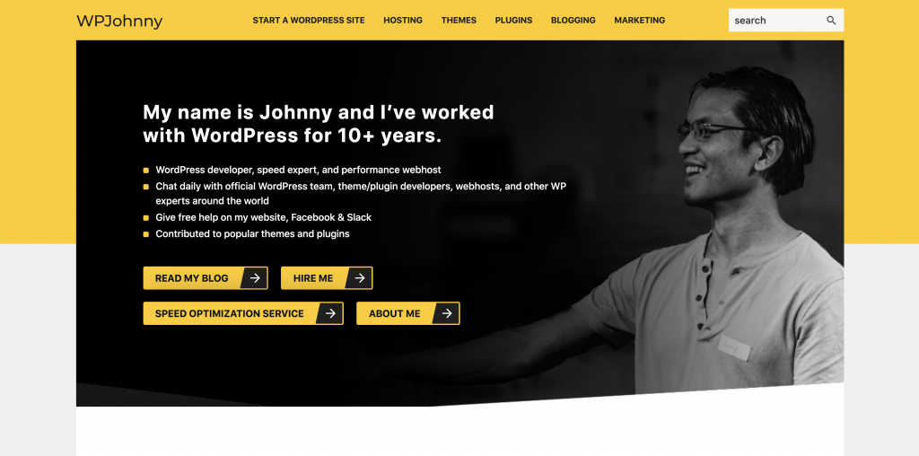
1. System-font typography variation
Using only system fonts, you don’t have to do much work to make it look clean and uniform… but you have to do a lot to make different text sections stand out. You’ll see me carefully mixing different cases (UPPERCASE vs Sentence Case). Playing with font-weight and being cautious not to over-use bold. Also playing with letter-spacing. Lastly, I use color highlights or other design aesthetics like blocks behind the letters to make them stand out.
Basically…you just have to be creative and you can use the same font over and over. And it feels clean and uniform but not boring…AND…it’s easy to see the distinction between different text. You know which is more important, you know which is what (a link? a category? an article?).
You’ll also notice I used square bullets. Because I feel they look so much nicer (than circle bullets) with my geometric design.
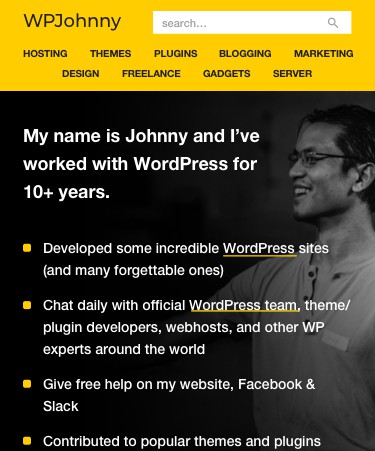
2. Text-out MENU, no hamburgers in mobile
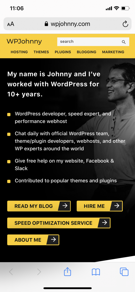
What many people don’t know is that I’m an absolute menu fanatic. I can easily spend 2-4 weeks on just a menu alone. (I’ll do up to 300 versions to find the perfect one.) Check out some samples here of a future menu I was thinking up. As you can see….what looks simple in the end, was not simple to create. 😉
If you don’t know, I extremely dislike the trend of hamburger menus. I think they’re stupid and almost always the worst choice for 95% of sites out there. If you ask me…I think they are copied by everyone because some fancy store used it to neatly tuck away their 30-link menus…and then some amateur thought it’d be smart to do the same but for (only) a 5-link menu. It’s a bad idea to copy someone just because theirs looks nice…what fits them won’t necessarily fit you!

I decided to leave my text links out in the open. I didn’t invent this design but I love it. Everything easy to access. You don’t have to click on an ambiguous icon to know what’s in there. People can’t shop from what they can’t see. Do you ever see a store with items tucked away in cabinets? No! They leave everything out. Same for your site…everything must be outside!

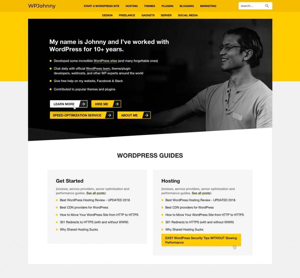
3. Personal (HOME) HEADER
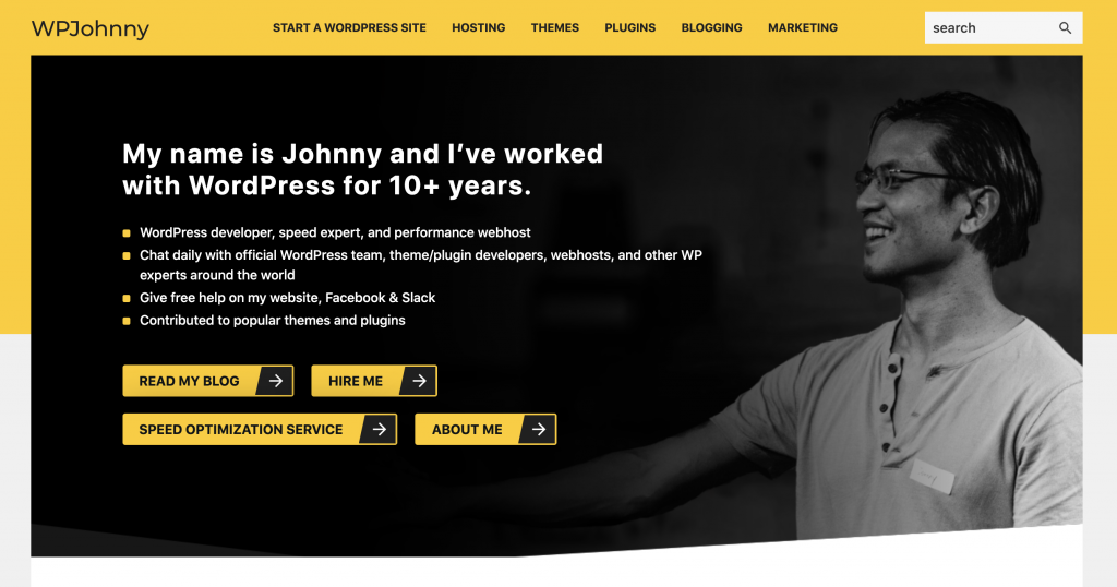
I put a picture of myself and some basic description of what I do. I think it’s important to understand the context of why I do what I do. I don’t care about selling people on services.
Recently though, I had to put some service links up there because some people really were looking for my services. But generally, I assume most people on my site are just looking for free DIY info. And so I don’t want to harass them with any paid stuff at all!
4. HOME page sections (LATEST, POPULAR, and SERVICES)
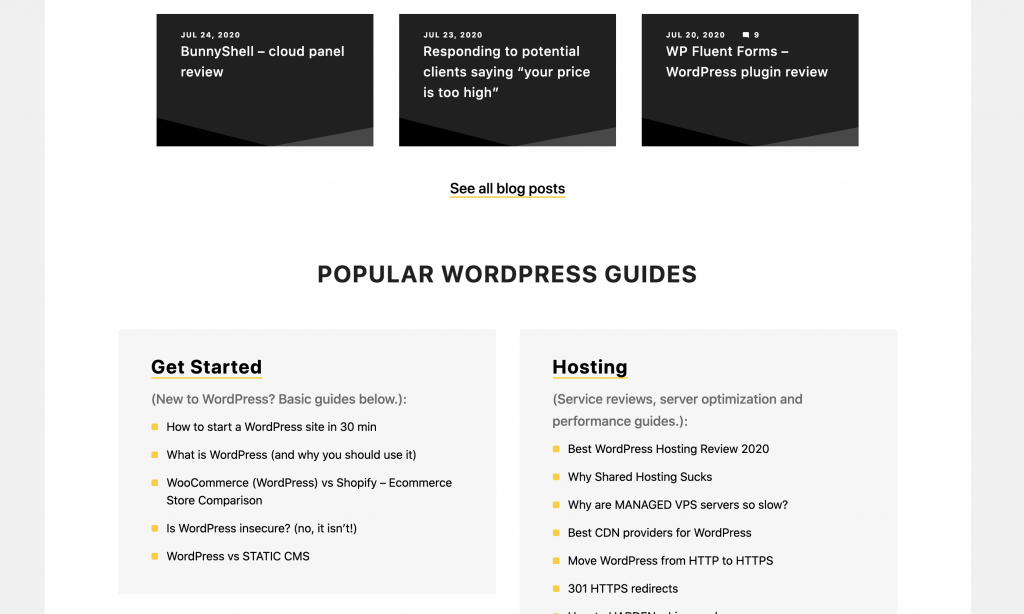
It sounds so simple yet it was really difficult to think this one up. I wanted to make my site easy to remember and easy for people to find only what they want. If you want only the latest posts, it’s right there. If you want the popular/sticky posts, scroll just a little further. If you want my paid services (I imagine the fewest amount of people), go towards the bottom.
Most other sites do some annoying version of:
- Paid services at top. Lots of selling and promising to prospective clients. Free stuff buried at the bottom.
- Paid and free stuff interwoven into each other. Hard to tell what’s free and what’s not. Especially since the free and paid stuff have links in the same menu, or blocks right next to each other. Or the paid links keep having distracting colors.
- Tons of posts on front page only, and the popular/sticky ones are hard to find. Or services are hard to find.
The reason why I feel these popular versions are annoying are because it’s not what people want. Most people don’t want to pay for anything. The just want free help and that’s it. So give them what they want! I don’t believe in tripping visitors over my sales pitches on their way to what they want.
I just give them what they want. If they don’t want to spend any money, so be it!
5. Service blocks (HOME page)
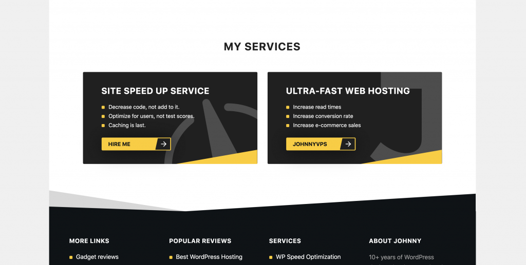
If you pay close attention, you’ll see it’s nothing fancy. I just give them a nice image aesthetic by sticking a giant SVG in there. It’s much lighter than actually putting an image. And still does the job of drawing the viewers eye. What I like is that they show up if you’re looking for them…but can also be quietly scrolled past if you’re looking for something else.
6. Informative FOOTER
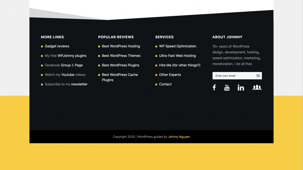
The goal here is to have a few helpful links. Useful links links, social media, service links, and small bit of info for people who scroll to the end of my posts. I treat the footer as a scroll card. It should be beautiful, informative, yet non-distracting. Anybody who lands there gets a soothing ocean of info to swim around.
The angled edge is to give it some personality. It doesn’t cost anything…it’s easily drawn in CSS, doesn’t require an actual image to be loaded or background texture file. If you look carefully, the footer uses about 5 colors (white, black, yellow, grey, darker grey). But I work hard to make it feel like only 2.
7. Title-blocks on CATEGORY (archive) pages
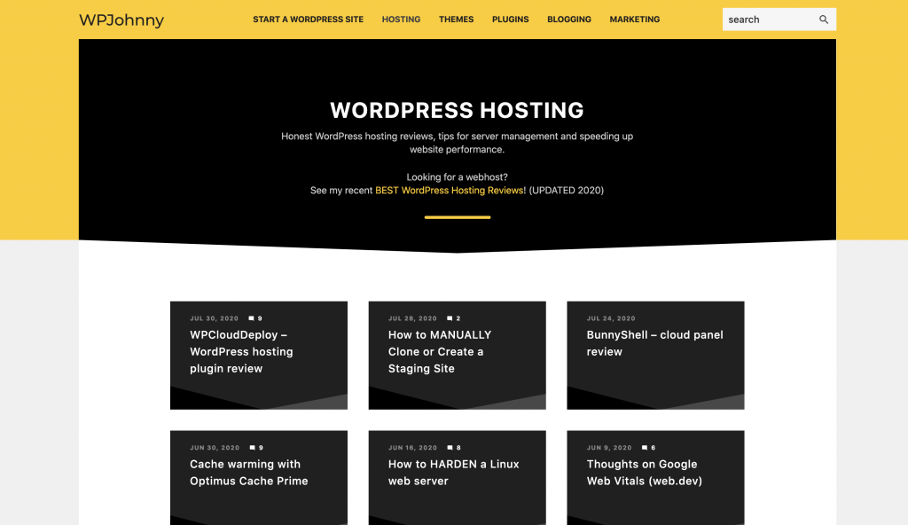
I loved this because showing only titles (no images or intros) allows me to show tons of text content. Most sites try to put extra in there to entice you to click in but I hate that. If you’re reading my site, you know my quality of work and don’t need to be sold on it. If the title looks good to you, you can click right in. Putting intro text is IMO only necessary for sites that need to coerce users to click. If you have good reader trust, save that space for titles instead!
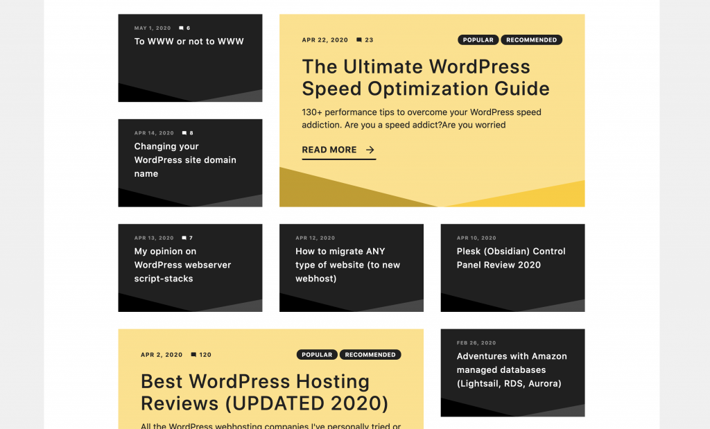
You’ll also notice I highlight certain posts using my accent color (YELLOW) or make the post extra big. Sometimes I do a combination of both. In hindsight, I should have took the border-radius off the tags to make it more uniform with the category tag blogs in single posts.
You’ll also notice I don’t paginate my archive pages…all posts show on one page This makes it convenient to search through all posts using the browser search function. But usually…people just click the first interesting thing they see and get lost from there. If it isn’t obvious, my design style is somewhat inspired by the Youtube-browsing style.
The description at the top if used for the category and also for sticky posts. For example, I like to show a complete webhosting review post so people can get general info on all at once.
8. Clutter-free SINGLE POSTS using color
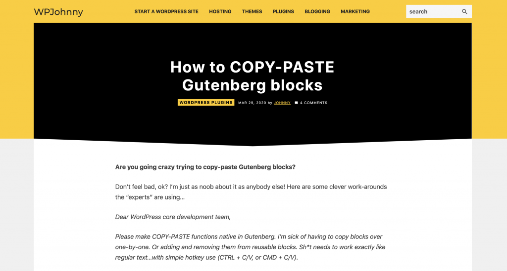
The hardest part about designing clutter-free single posts templates is helping users scroll quickly through sections. I don’t want them to search for the title, date, author, etc. You’d be surprised but many blogs are filled with all kinds of advertising or unnecessary info at the beginning of each blog. It’s annoying when there’s so many obstacles around the title, and also between the title and the content text.
So my goal was to make the title super clean and easy to see. I wanted extra info around the title but as non-distracting as possible. Even invisible…BUT if you wanted to look for them, they are instantly easy to see. If you look, you can see the category, date, author, and # of comments (which also links to the comment section).
The header that houses the title has a nice color contrast from the content to make it easy…but I wanted to account for potentially-long titles. I didn’t want users to see a giant header block (creating even more yellow on the page) or be confused whether to scroll down further or not. And so I decided to make the subtle down-arrow point on the bottom of the header block.
The tag blocks were really distinct. There’s a reason why I used blocks behind the tags. It’s because I wanted them to feel more like tags than breadcrumbs. If you have them only as links, I felt it wouldn’t look as clear what they were. At the end of the day, they look like topic tags but they’re actually categories.
The font size, content-width, and line-height are the absolute most painful balance. It will take you many tries to make it feel right especially if you’re trying a new font. Sure…you may have seen many sites out there look great. But their design only looks good with 2,000-word posts or less. The moment they write more, you can feel how inefficient that “pretty” design is. It’s endless scrolling and also a pain to quickly find the section you want. I wanted my content section to feel clean but also not scroll forever for long posts.
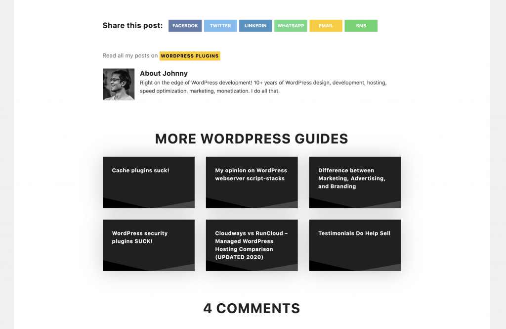
After the content comes the social shares, author info, related posts, and comments. Social shares and author info, I wanted to be as inconspicuous as possible. I hate the idea of annoying conversion boxes or begging for shares here. I don’t care too much for proving my share counts either (might change my mind later). The info is noticeable only if you’re looking for it. Otherwise, just scroll past.
The related posts was the most important part here. You’ll notice that I inverted colors here to make it stand out from the content. It also cleverly re-uses the same block design from the category archive pages so that you know right away they are other posts. The idea is simple…people keep clicking on these to explore more content, much like how people browse Youtube.
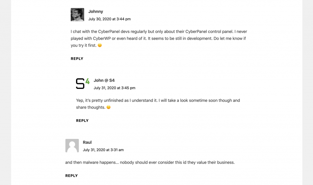
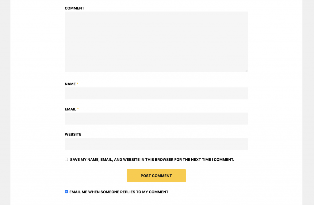
Last is the comments. If you notice, my comments are very simple compared to other sites with lots of colors and info. I do this by not creating so much color distinction between comment comment author, time and date. Other sites do it make the hyperlink aspects more clear but I don’t. My spacing was also perfected from years of doing this on my other sites. I do think the time and date should be moved up maybe 1px or so. The comment form is a great display of how I use to texture to avoid drawing boxes. Notice how the form fields have many boxes but you don’t really see their annoying border/boundary lines? Only thing left is my accented yellow button and this darn post template is done!
9. CONTACT page – rules of engagement
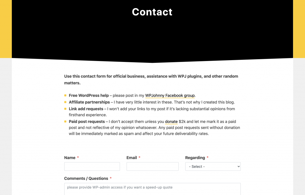
My contact page was written to discourage “unwanted” people from contacting me. I’m tired of the endless spam, business offers, paid link and post requests. I’m even tired of client requests. There’s only so much one person can do. So I try to clearly define who can contact me and who should not.
I also tried to make the contact page as short as possible.
10. List-style archive page as 404
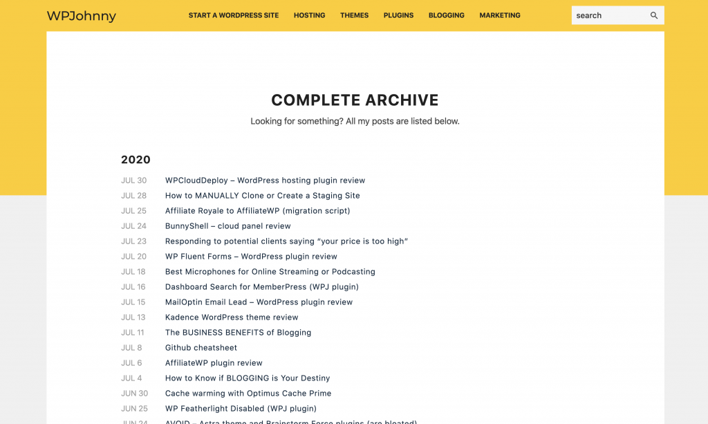
Try hitting a non-existent URL on my site and you’ll be greeted by my list-style 404 page. It’s a complete archive of all my posts in list format. Easy to scan through and by date, or search for whatever you need. If it isn’t obvious, the design was inspired greatly by the Zen Habits archive page (they’ve since redesigned but I prefer their old layout better).
Praising the copycats (WPGuineaPig)
I’d like to feature WPGuineaPig because he/they did a great job ripping off distinct elements of my design. I accept all imitation as flattery and honestly, it’s at least the 20th time that my work has been copied. I’ve built many sites even much more successful than WPJohnny. 🙂
Let’s go through the details and see how many similarities we can find between WPGuineaPig and WPJohnny.
1. Concept
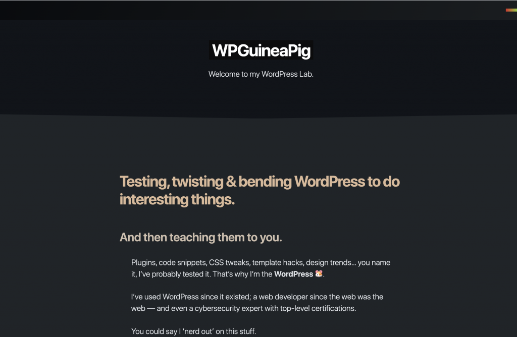
He has a similar 1-man, honest helpful free WordPress advice vibe. Seems like a cool guy I might even be friends with. He has a wide range of skills and likes to test many WordPress things. Like me…he reviews webhosting, themes, plugins, and WordPress performance matters.
2. System fonts
Yes! He went with a super lightweight system font just like mine. SystemUI on Mac, SegoeUI on Windows.
3. Simple text mobile menu
He didn’t lay his text outside. It still requires a click. But the layout is uncannily similar, IMO.
4. Using the words “Unofficial Guide” in his post titles.
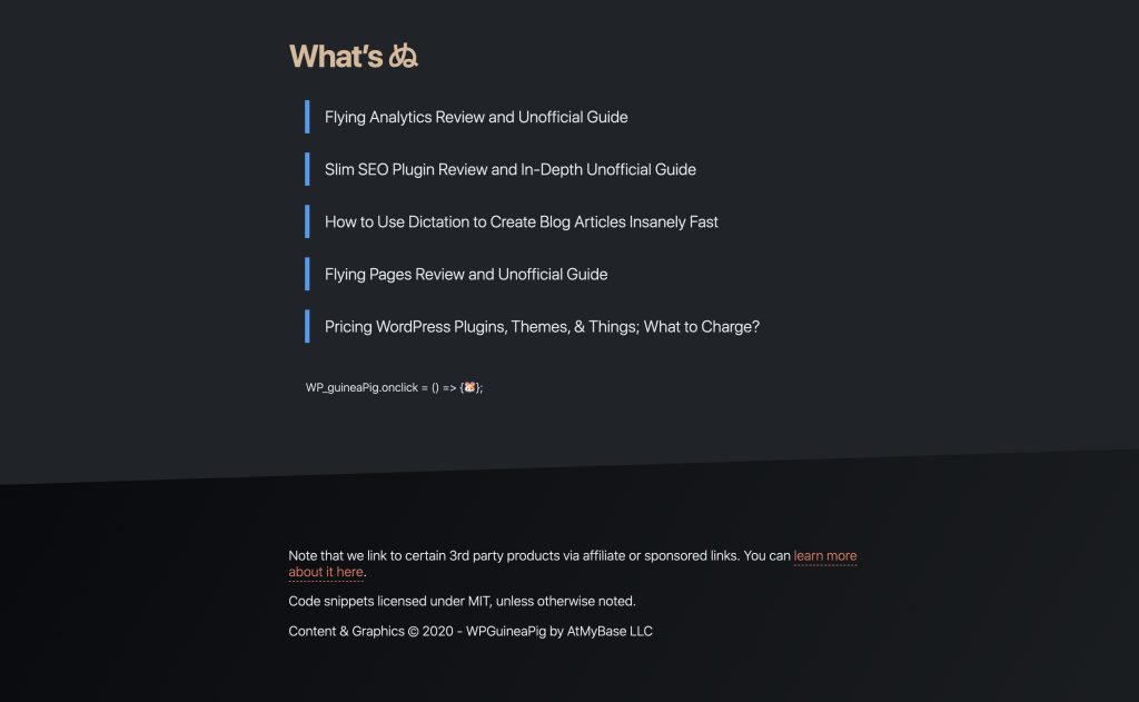
He copied my naming convention (putting “Unofficial Guide” at the end). I like to use the word “unofficial” because it clearly denotes a divergence from the “official” documentation. I don’t do this to be cool or as some kind of copywriting gimmick.
The thing is I’m very involved with the official developers for many themes, plugins, services. You may have seen me often on community groups like Swift, LiteSpeed, and many others. And sometimes people think I actually work for those companies but I don’t. So I use those labels to clarify. I’ve thought about using labels like “best settings” or something like that but just felt my articles would be lost in Google searches full of guides claiming the same thing.
And so, I decided to go with something as un-special as “unofficial” simply because it felt most accurate IMO. It’s a matter of necessity.
5. Title-blocks on Category (archive) page
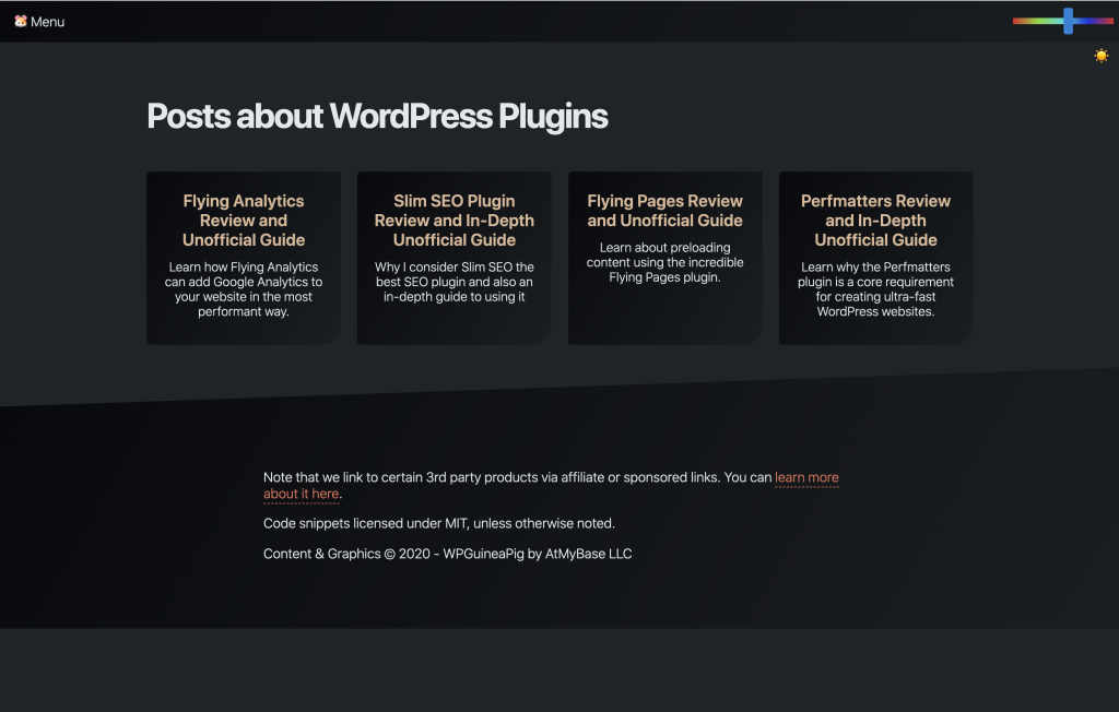
He copied this as well, naturally. When you don’t use featured images with your posts…it’s a tad trickier to make separations between your bits of text. And so you have to draw boxes or demonstrate spacial separation somehow.
You could leave items in a list. Or do what many news sites do, which is leave the titles arranged in left-aligned blocks and let the spacing define their separation from each other.
6. Pointed headers with category tag blogs underneath
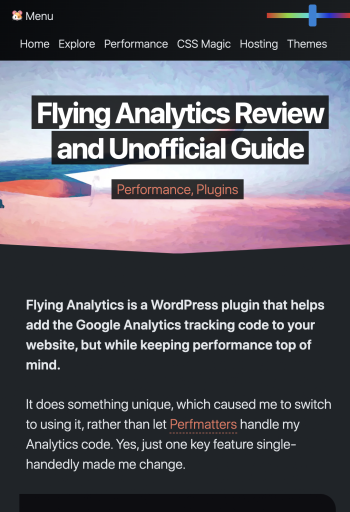
There are several elements copied here. First he copied the bottom point of the header (even the same slight-angle). Why didn’t he go straight? I have no idea. Next he copied my block tag design idea, putting solid blocks behind the category names.
7. Central archive page with all posts
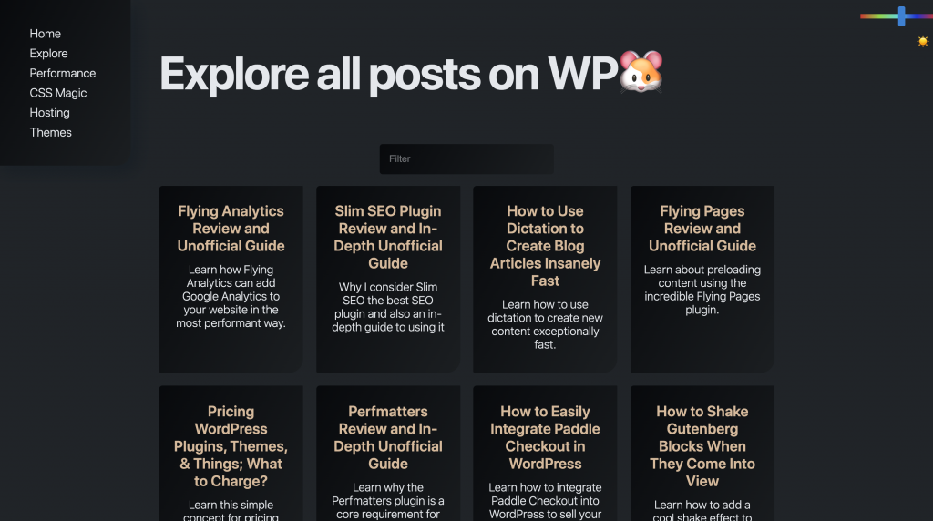
He also has a central archive page showing a link to all posts. The difference is his has a search filter and my current one does not. Funny that great minds think alike, my updated WPJohnny theme design (not yet finished) already has this planned but also a few other handy things to make topic searching faster.
8. Angled footer

Lol….shameless. I don’t know why he chose to copy it but I’m guessing it’s because he found it hard to add flavor without. I added angular lines to my design to help break up the monotony of flat blocks. I wanted to use angles to help people differentiate between different sections of content.
It’s funny that he even angled it the same way. In reality, I think it’s the only sensible option because of the way text paragraphs tends to look when left-justified.
9. Square bullets
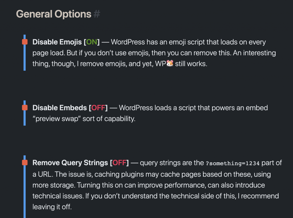
He uses square bullets as well. And I think they look great with his added bar-styling. Very fun and awesome!
10. What is WPGuineaPig’s design missing?
I thought his design was very clean and cool. Fun, colorful. The inverted light text on dark background scheme is always fun for tech sites. But here are what I think are completely missed opportunities:
- Using food pellets as bullets – since he’s keeping with the cute critter vibe, I thought it would be fun to use food pellets or triangles as bullets.
- Clashing geometric harmony – the angled elements he copied from my site (header point, angled footer) don’t go with his brand IMO. He should have kept things more round like the TOC blocks or text blocks in his content.
- Lack of color hierarchy – he has many colors throughout the site but it’s hard to know which one is more important than the other. Sometimes the color is for hyperlinks, other times for headings, other things for random bits of emphasized text. And colors even switch between different pages.
- Desensitized bold effect – I think he uses too much bold throughout the site that it’s no longer noticed as easily. The more design elements you put on your site, the more desensitized readers get. Which then forces you to come up with more design elements to make things stand out…which only further desensitizes your users’ eyes.
- Hidden home link below 1600px – I think this is by far the biggest fail of his site design. You have to make 2 clicks to get back to the home page if your browser is below 1600px. This really really sucks in terms of UX.
Dear “WPCopyCat” aka WPGuineaPig,
Thank you for copying me. That you chose my design when you could have copied anyone else speaks volumes to the quality of my work. And greatly validates the painstaking design decisions I have made. To so proudly show how much you want your work to resemble mine really is a compliment. Many others have expressed it but few have attempted on your scale. Imitation truly is the greatest form of flattery.
Your original…
WPJohnny
EDIT, WPGuineaPig responds!
- The Design Journey and Real Inspiration Behind WP🐹
- He defends his design choices as not being a copycat of WPJ but instead of Alligator.io. (haha)
- He also stopped using “Unofficial Guide” in his titles.
In any case, WPGP is similar enough to WPJ that even other people thought the same. There were several uncanny similarities. I don’t expect him to out himself. Usually the proud copycats even let me know before they copy. LOL, people.
That someone else could come to so many parallel design choices is intriguing. Either somebody is copying, majoy fanboying, or simply a brother-from-another-mother. I’ll never know which it is but will enjoy our unexpected backlink-trade for now.
The era of copycats
We are living in an era of copycats.
In a time when people find it easier to rip off from others than to make their own. And I don’t blame them one bit. If you don’t have the knowledge, skills, life experience, or uniqueness of personality…there is no other way than to be a copycat.
I’ve borrowed from others myself but never so blatantly. There are two reasons why:
- Because no true artist ever wants to be a copy of another. There is no greater insult to an artist than to be called a copycat.
- Because to copy others would be a disservice to yourself.
Hopefully, I was able to help by walking through a little bit of my process. Perhaps you can learn how I think. Perhaps you can learn how YOU think. And perhaps it will teach you to make something that you can proudly claim as your own. Not because it’s unique. But because it truly serves you.
So what does it take to be unique?
You have to focus on yourself. Your needs. Your style.
- This is a guide I wrote before – How to Make a UNIQUE Web Design
It’s tempting to just see other people’s work and say, “Wow, cool! I want that! Let me just copy!” but you miss out so much when you do that. It’s a disservice to you more than anything. You completely miss out on an opportunity to really serve yourself.
Can you imagine how much less exciting WPJohnny would be had I just copied the same exact design as someone else?
I urge you to listen to the artist inside you. Don’t express yourself the way everyone else does. Use your website design to create a unique medium for your message. My message is text heavy and no images. Maybe yours will be numbers. Or pure videos. Or pure audio. Who really knows…but listen to yourself and create a medium that reflects you.
Have reason to your details.
Every little detail and nuance of what I do is meticulously thought out. Every line, every element.
- How big or small should things be?
- Why 10px and not 20px?
- How much space is the perfect amount?
- Why this shade of yellow and not that one?
- When you make things similar, how similar do you want them to be?
- When you make things different, how different do you want them to be?
- When one thing is more important than another, how much difference is it?
Your design needs to address these questions in words, and then in design. The human mind is always subconsciously working to understand things. Your design must explain it immediately! Then users feel great and enjoy your site because they trust you. Things make sense!
I do start off my designs with random ideas but then I push the idea in both directions (just to see). I try to make everything too big, then too smaller. Too light, then too dark. I push extremes in all directions that I can. Quite often…you find some things are left in the middle…but other things look incredible in one extreme. There’s no way to discover these “beautiful extremes” without exploring.
What it takes to design a website for yourself.
For me…it takes a minimum of 100+ revisions of everything. Nearly every aspect of the design took 100-300 revisions. The WPJohnny you see today had hundreds of iterations…I might stick them up some day for fun if you guys are curious. It was really tiresome and long tedious process. I threw out many designs that I felt would have been considered “perfect” by other people’s standards.
You have to be willing to spend many months. Lose sleep over it. Get frustrated. Make gut decisions that reverse the very next day. It’s a lot of torture, ok? But by the end of it…I promise you….you will have something so beautiful, not because it looks great but because it looks like YOU!
The current WPJohnny 2.0 design you see today was started in 2017 and not released till about 2018. I was happy for a year or two and then started noticing things I felt could be totally improved. I’m now already halfway through my new designs for WPJohnny 3.0. I never stop improving and digging deeper within myself to find what is truly me. And neither should you.
Enjoy the process.
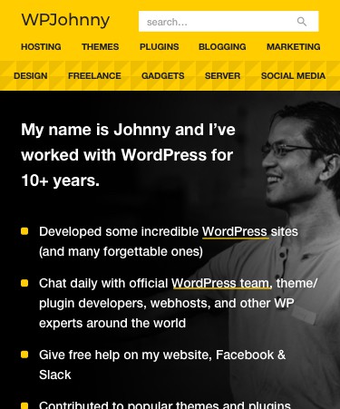
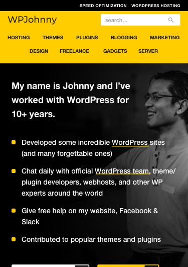

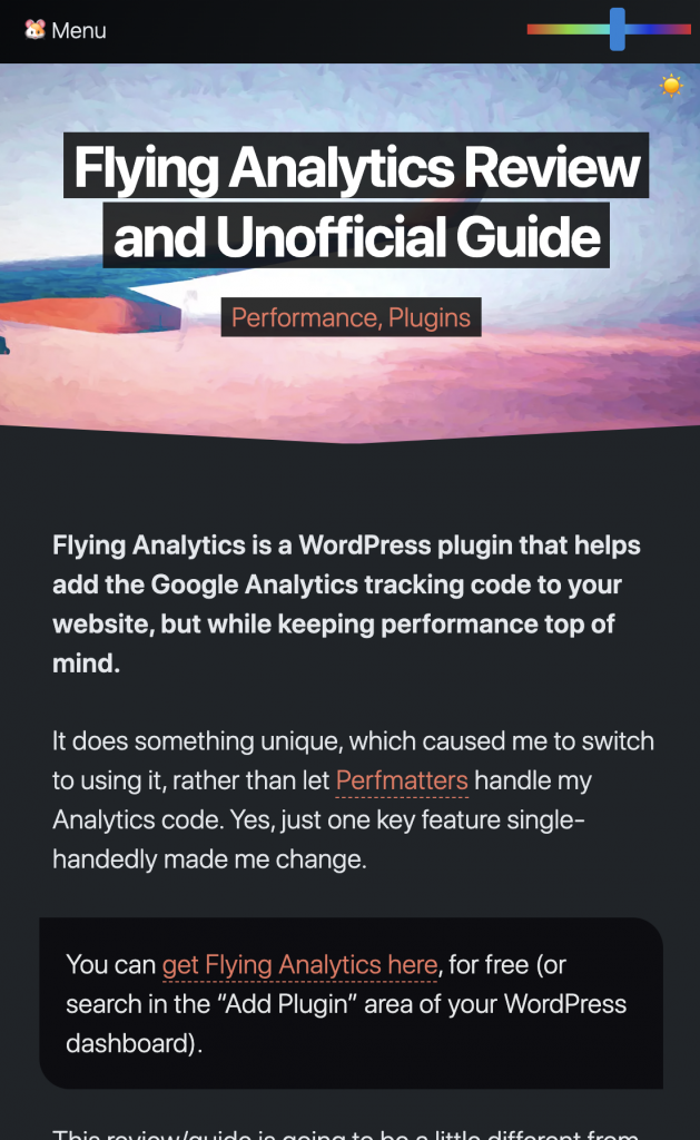
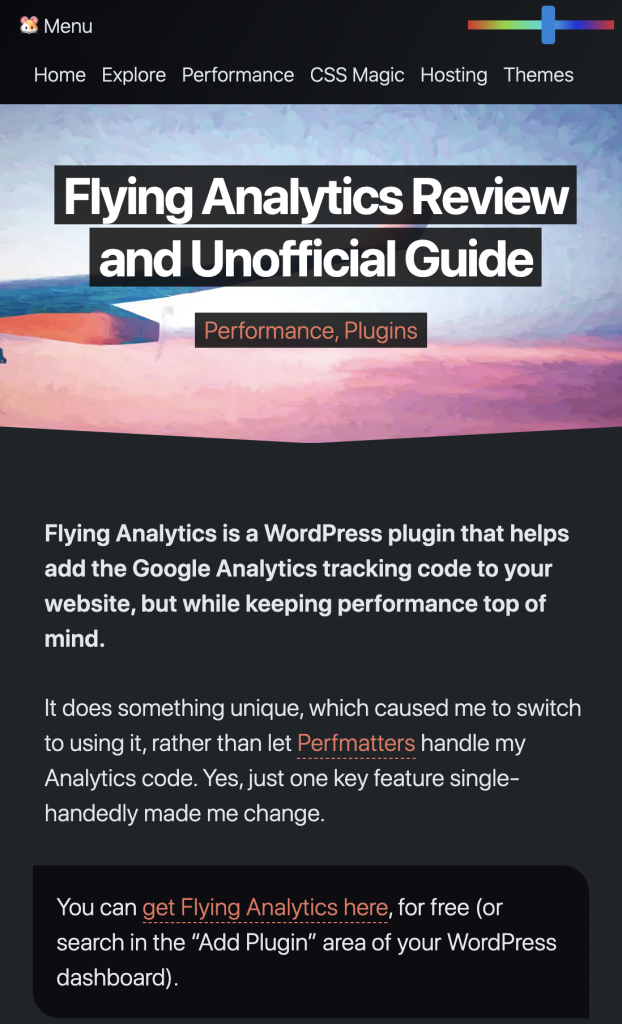
“no hamburgers in mobile” – I really liked this one. I should try this.
Join me on the dark side! I’d love to see it. 😀
Your design is great. The only thing that is missing is a sticky menu. I have to scroll all the way up to find it.
I hate sticky menus because of how much space they take up. I also feel most my posts are short enough that scrolling is no issue. Just a 1-second finger flick. But thank you for feedback!
PS: you can scroll up in mobile by pressing the top (middle edge) of your screen.
Lies………
I tried it, takes 2 finger swipes to get to the top of this post lol… now i probably strained something :p
Hahaha!
Dude, I think you are overreacting.
Please watch this excellent documentary until the end and chill out.
Everything Is a Remix:
https://www.youtube.com/watch?v=nJPERZDfyWc
Dude, I think you are overreacting to my fan-praising. I do a lot of tech, art, and various other NDA-related things. Well aware of the “nothing is new under the sun” sentiment. Thanks for your comment.
I think you did an excellent job with the design, Johnny. But the look and feel of his site is completely different, so I’d say calling him a copycat was inappropriate. Basically, he used some of the same ingredients, but cooked a completely different meal. Yes, it’s the same cuisine, or “subject matter” if you will, but the meal is very different. You can’t copyright the use of certain ingredients.
But yeah, with the other site it’s a different matter, as the look and feel is similar.
I guess we draw the line at “copycat” differently. You seem to think it’s only a copycat if it’s a blatant clone. I’m simply going by the dictionary definition:
– copycat – a person who copies another’s behavior, dress, or ideas
Regardless, I’m not demanding him to change his design or seeking legal action or anything crazy like that. I simply leave my honest opinions on the web and carefully explained why. He even admits himself to having copied others. It’s no big deal. I enjoyed the uncanny similarities between his site and mine. Makes for a fun post.
Well, is your blog the first site in the world to use system fonts or did you see it somewhere else before? How about the boxed layout? Have you seen it before? How about the site footer? There is no requirement for a website to have a footer. Having a footer is not original at all, it has been done a gazillion times before by other sites. Does it matter? No, because these things are ingredients, not a recipe.
Please watch that documentary and see how Star Wars copied ideas and scenes from other movies. Yeah, they literally used scenes from other movies as “templates”. Does it make Star Wars the work of copycats? For crying out loud… For what it’s worth, I am not a Star Wars fan at all, I like Star Trek much more…
Everything is a remix, anyway…
Everyone finds inspirations from multiple places. But when you have several from ONE place, you’re deemed a copycat. Even if it isn’t true…other people can legitimately have that opinion. Just like how anyone can say…oh Kung Fu Panda is a Star Wars ripoff, or such and such logo looks like another logo.
And before you bring up Star Wars again…must I inform you that Star Wars has sued COUNTLESS other companies/people for supposed infringement of their trademark and intellectual property. You can drop that reference now and forever because it certainly isn’t helping your cause. Please rethink your logic before responding again.
I love your design!
Hey thank you, Fabio!
I have to agree with Thomas, man.
“my design style is somewhat inspired by the Youtube-browsing style.”
Why is it inspiration when you do it but copying when someone else does?
I use square bullets and system fonts on my website too. Does that make a copycat?
Highlighting a blog post by making it bigger? I do this on my site as well using the Astra theme. Does that make me a copycat?
Useful links in your home page and footer to help the user better navigate your website and adding categories below the blog post title? Damn, never seen that before.
It’s not like people who work on SEO do that all the time.
You sound like a 10 yo girl who’s pissed off because her friend Nancy is wearing her same dress.
Sorry Mike, you sound awfully emotionally invested in this despite neither site being related to you (or are they?). I can’t tell if you’re actually ignorant or feigning it. The similarities are concretely observable. That there is a noticeable pattern of several things being more distinctly alike than different gives validation to my sentiments.
You sound like a 10 yo girl who’s crying because her friend is crying. (lol)
I agree with Thomas and Mike. The copycat claim makes no sense.
It’s not a copycat, just an inspiration 😊
I advice you to please publish this child theme for public.
Yeah everyone use it, and you can say proudly near 100,000 people using WPJOHNNY theme.
Great?
You must think I care more about being popular than being original. 😉
Being original?
Then…..
How we can use wordpress?
How we can use Genesis?
How can say best themes in 2022?