My tips for designing restaurant menus, for mobile devices.
Somebody’s gotta say it. I’ve been eating like a king for many years and didn’t realize how poorly designed restaurant menus are until now (that every restaurant is doing the QR code to web menu).
I hope designers out there are listening and taking this advice to heart. Cuz I wholeheartedly mean everything that I say here.
- Make your site load fast. Cut out stupid videos, music, animation, giant images.
- Allow web version and PDF version (cuz some people like 2D-scrolling across PDF menus, or our returning customers who remember the physical menu).
- Make text small and with minimal line-height to fit as many things possible on the screen. This reduces unnecessary scroll and helps people remember more choices (to compare mentally).
- Don’t bother having pictures of every item, unless your food really looks that unique.
- Don’t do sticky header. C’mon!
- Don’t make the QR code load images off your Google Drive. COME ON!!!
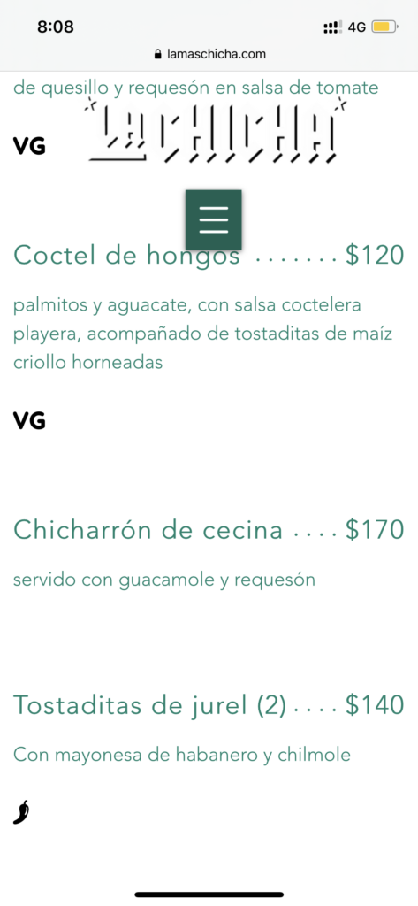
In all honesty, all designers have to do is actually look at their work in mobile and see how it repaints. One look alone would be able to tell you what needs to be changed. Look at this abomination below:
- Giant waste of vertical space.
- Horrible sticky header.
- Where is the logo contrast?!
- Those vegetarian “VG” initials could have easily been little tags next to the item name. Or in parenthesis at the end of the item description.

Simple but very important on-point post.
Also, your last word remained me of this plugin https://wordpress.org/plugins/ewww-image-optimizer/
Maybe a blog post on naming principles will be good too! Haha