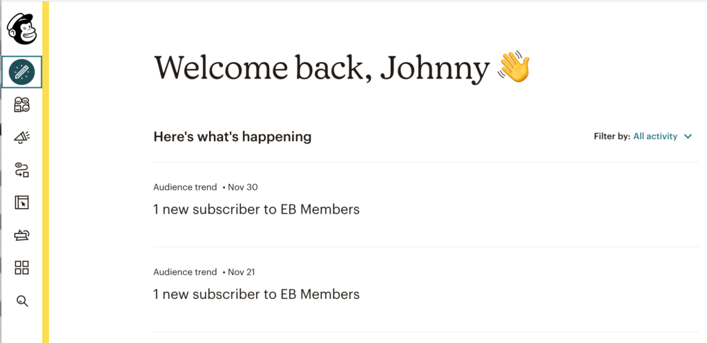
This is a rant post and needs to address the born-again “modern” design trend of using icons instead of text labels in website navigation.
It annoys the hell out of me and so unprofessional!

This was my exhibit A. And it’s not the only one I’ve been seeing lately.
I keep seeing more and more design layouts relying on the use of icons. It’s not only for menu UI but also “fancy” pagebuilder templates as well.
What’s the problem with ICONS?!
The problem with icons is that they’re images…but used in place of text.
And our mind “reads” most things faster when looking at text.
- It’s much easier to see “Home”, “Pricing”, “Account”, etc.
- …than it is to see [house icon], [dollar sign], [person icon].
Icons and images are ambiguous. That saying “A picture says a thousand words.” come to mind. Whereas…a word says only one word.
Look at the MailChimp nav icons above. See if you can guess exactly what each one does. I have no idea and I’ve been a MailChimp user for at least 6-7 years.
Where the icon trend came from.
If I had to guess, it came from mobile apps. With limited screen space, you’re tempted to use cute little icons instead.
- Instead of “search”, you have a search glass icon.
- Instead of “cart”, you have a shopping cart icon.
And those icons are fine because they’re so ubiquitous. There’s absolutely no confusion what they mean and what they do. They’re also almost always found in the same place on every website.
This isn’t the only reason why designers use icons in place of text, but I’m too lazy to cover the other ones.
How to use icons properly
I’m just speaking design logic, not artistic theory… OK?
PRINCIPLE #1 – don’t use icons in place of text.
Icons are not text. And they never will be. A star icon doesn’t clearly denote the word “features” or “benefits” or “special”. The star icon could seriously mean anything.
What you can do however is put your icon right next to your text. This is useful to help align adjacent blocks of text and help show their contextual relationship to each other.
Here, you can look at my webhosting site JohnnyVPS.com, where the blogger/business/agency cards have 3 icons, and beneath that the Features section has icons for each text block. The icons may look pretty but nobody “reads” them. They’re just there to help add relational context to the blocks of text.
PRINCIPLE #2 – use icons as images, but never next to images
It’s common to see blocks of content designed with a mix of TEXT & IMAGE. Sometimes big text, small image. Other times big image, small text. But what you shouldn’t ever do is put ICONS next to IMAGES. The images add visual context and organization the text. Or the text add informative context to the images.
Because it’s stupid.
It’s like trying to describe images by surrounding it with more images. It’s dumb. If you’re going to use icons at all, then it’s assume that they are acting as the image and the only thing that looks good next to it is text. (Unless of course, you’re doing an app-style navigation where the icons are next to each other as menu items.)
PRINCIPLE #3 – use as few icons as possible.
As with anything, “less is more”. Too many people sprinkle icons like they’re visual candy and they’re not! Every icon takes you a few extra seconds to understand. And when you put so many icons near each other…the mind takes even longer to process them.
Sure it’s one thing if you’re a furniture store using clear icons of a chair, table, lamps, desk, etc. But it’s another thing when you’re putting pencil, circles and squares, megaphone, squiggly line…like silly ass MailChimp.
Of course, I understand what the icons mean AFTER I hover my mouse on them. But that’s defeating the point of the design. If the design doesn’t tell you what it is at first glance, then it failed!
EXACTLY… it’s stupid stuff like this that makes me want to leave mailchimp after being with them for many years… I use it daily and still find myself hovering over things to see what they say before clicking it..
&*!@^$(@*$^*(!!!!!
Add to the confusion if you suffer from attention deficit disorder!
I remember them teaching this stupid philosophy of using icons instead of text when I was at uni 12 years ago. I thought: no one developing real software could actually be this stupid – how is the user going to know what anything does?! Then Microsoft got rid of their drop-down menus in place of the ribbon bar (a confetti of icons contained with a tab), then touchscreen became a driver to make UIs oversized so that its flawed means of interaction with the UI could still work and then developers became too lazy to make layout panels be able to adapt to different lengths of text for different languages and so settled on fixed-size icons. Meanwhile Visual Studio is still going strong with more features than would be possible to create distinct icons for and the good old text-based menus to allow users to find said features – and you get access to all of that through a menu bar less than 30 pixels in height or better, user-assignable keyboard shortcuts!